Homepage Redesign
Team
1 designer,
Year
01/01/000
Company
Outschool
Year
2023
Client
Name here
Year
8 engineers, 1 product manager
Company
Outschool
Year
2023
Why I chose this project: This project highlights how sometimes a role can extend beyond its traditional boundaries, allowing you to tap into unexpected skills and life experiences. With the rise of generative AI, designers now have the chance to explore new possibilities and become versatile problem solvers, rather than focusing solely on specific UI/UX tasks. The product design role is shifting from being more specialist to more generalist. This case study embodies that shift.
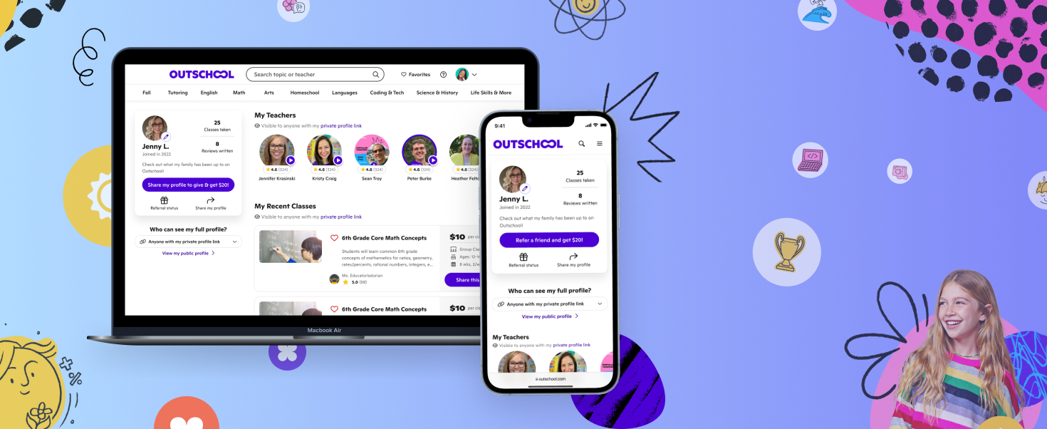
Problem and context: In 2023, Outschool’s homepage was the highest trafficked page for new buyers. My product manager and I saw a big opportunity to optimize the top of the funnel by addressing user problems on the page. The biggest issue with the homepage was that it failed to position Outschool as a real solution for parents. As a result, our intended value proposition was not coming through effectively, which caused aimless browsing and high bounce rates.

Redefining our value proposition
To effectively resonate with our parent user base, I undertook a deep exploration of our value proposition with the help of the UX Research team, transitioning from the broad theme of "freedom of learning" to a more targeted, goal-based message: empowering children to achieve and pursue their passions. Recognizing that our existing users appreciated the platform's diversity and range of learning options, the challenge lay in harmonizing this with our new focus. Through iterative design and concept testing, I converged on the idea of centering our messaging around exploring kids' dream jobs, seamlessly blending the value parents currently receive with our aspirational goal of fostering goal-based learning.
We wanted our value proposition to reflect a true “job to be done” versus a philosophy of what learning should be.
Concepts & iterations…

A vision realized with generative AI
I aimed to create a dynamic hero image and messaging for Outschool that showcased our value proposition and engaged parents, concluding with a search bar CTA. After exploring various concepts, I envisioned a rotating animation of students in career uniforms to emphasize how Outschool helps kids achieve their dreams. Initially, I considered using photo collages from our brand guide, but the cost and legal complexities made this approach unfeasible. Instead, I turned to Midjourney AI's v5 for its photorealistic capabilities, creating brand-aligned visuals in days rather than months. With legal approval, the vision became a reality. With the growing anxieties about AI, when creating these assets, quality control was paramount. Asset design is not typically my area of expertise, but new opportunities in AI have allowed me to leverage my visual skills to design them quickly.

Choosing the right call-to-action
Choosing the right CTA was crucial to delivering the best homepage experience, and reaching our KPA goals. Previously, the CTA took users to a generic browse page, that didn’t serve any specific job-to-be-done.
I wanted to focus on an CTA destination that not only had high engagement and conversion rates, but also followed through with the narrative from our value prop and JTBD: We help your kid build to their dream job. I worked with my PM and the Data team to find which surfaces had the highest conversion/engagement rates. I found that our search feature would serve as a perfect conclusion to our homepage messaging - while also driving our KPI’s.

Optimizing for SEO vs. User Experience
During this time, the growth team had an initiative to boost SEO to reduce reliance on paid ads. While the strategy made sense, it often prioritized SEO tactics over meaningful UX improvements. The homepage became a point of debate, as some wanted to add more internal links higher on the page for SEO, but I argued this would worsen value communication issues and be a less effective way to achieve our goals. To align the team, I highlighted that improving UX—reducing bounce rates and increasing session times—would actually have a greater and long-lasting impact SEO. We reached a compromise by focusing the homepage on key category linking that supported parents' needs, instead of increasing the quantity of internal linking.
Experiment results
Bounce rate reduced ~35%
Average session time increase by ~63%
Conversion rate increase by ~26%
New buyer rate increase by ~22%