The Project
Problem & Context
The Stride mobile app began as a tool to help independent workers track their mileage and expense deductions for their taxes. While the product offered a valuable utility to our users, our team saw potential for more opportunities to provide value to solve problems independent worker across taxes, finances and benefits.
The product goal was to increase activation, engagement, and retention, but there weren’t any clearly defined user problems to solve beyond simply improving existing features. The challenge would be to discover and define unsolved problems for our users, and to ideate, design, and deliver solutions to user problems that might drive the key project KPI goals.
Project KPI Goals
Increase 7-day activation (user completes 3 core actions in 7 days)
Increase weekly active users by 50%
Increase 30-day retention by 50%
Increase revenue from Benefits purchases 25%
My Role & Team
For this project I was the sole designer and design lead, owning the entire design process end-to-end from design strategy, user research, ideation and wire-framing, user experience, visual design, prototyping, and engineering hand off/collaboration.
I collaborated closely on a daily basis with a product manager, as well as a team of 3 developers. Our team worked in a fast-paced Agile environment, using iterative and incremental releases to learn quickly and develop improvements over time.
Discovery
The Data: A Shifting Userbase
From the app’s inception, Stride considered the entire independent worker landscape as its core user base (gig work, real estate, massage therapy, etc.). However, analyzing the usage data told a different story: Our user base was shifting towards gig platform work, specifically delivery and rideshare. Gig platform users, who were lower income earners and had less contract work experience, had very different needs and behaviors than other contract workers (like real estate agents), who were higher income earners and more adept in contract work.
This provided an opportunity to reorient our focus on pain points for a specific user type that had been growing organically. By narrowing my focus, I would be more likely to discover problems that lacked solutions in the market.
User Interviews: Discovering “Jobs to be Done”
Instead of simply improving on existing features, I wanted to take a more generative approach to discovering problems and solutions for gig platform workers. I decided to use the “Jobs to be Done” (JTBD) framework, which is used for defining unsolved user needs. The basic premise of JTBD is that users “hire” a product to get a job done; and that innovation comes from the discovery of the job a user needs done, instead of “building a better mouse trap”.
Using the JTBD framework, I interviewed 20 Stride users who selected “Delivery” or “Rideshare” for their job category. For the interviews, I probed into their journey from beginning gig work, to them downloading the Stride app. By examining the contextual triggers and events that led them towards finding the Stride app as a solution, I was able to identify common problems or pain points users faced through their journey. The pain points without solutions highlighted “jobs” that Stride could do.
Above is an example of a user’s journey from beginning gig work with Postmates, to downloading the Stride app. The red “Thoughts & Feelings” bubbles denote pain points that the user can’t find a good solution for.
User Interview Takeaways
Examining events and triggers leading up to finding our product can illuminate user problems or “jobs” that Stride can do.
The most common thread among the users’ journeys were a lack of knowledge and guidance
13/18 users said they did not feel they can find guidance or support in navigating the 1099 world
10/18 users said they struggled with building habits to track their mileage and deductions
Vision Definition
After gaining insights about jobs to be done for our users, I worked with my product manager to define our vision of what the app could be. We started by orienting ourselves to the north star of Stride’s core mission and value proposition, then developed three pillars of how to achieve this mission based on the insights we learned from our users.
We then began a generative exercise of proposing feature and design ideas that would push the concepts of the three pillars of 1) Tools 2) Guidance & Knowledge and 3) Habit building. From there, we would have clear user story proposals that we could bring to engineering for estimates, and develop a plan for which ones to tackle.

Within each of the three pillars, the green post its are features and products that Stride already successful does. The red post-its are opportunities for features and concepts that Stride doesn’t have today.
Design Decisions
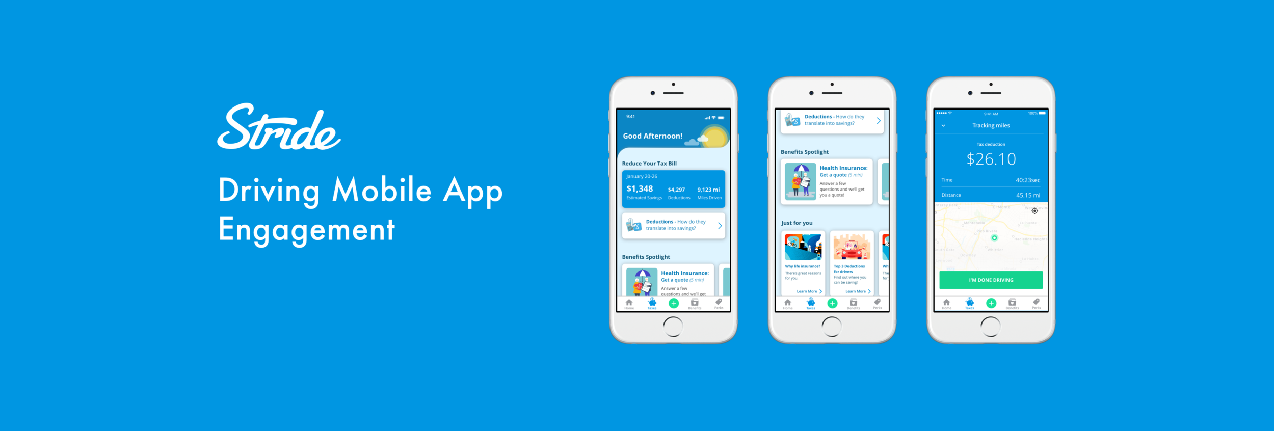
Home Page Redesign: An experience centered on guidance
The engagement goal for redesigning the home page was to drive engagement through content that educates users, and helps them to understand the value tools like mileage tracking, deduction logging, and tax estimation. Knowledge and guidance would then empower users to use the tools more efficiently, and build better habits.
Simultaneously, a monetization goal for the home page was to drive better conversion with Stride’s benefits marketplace products. I used the same strategy of using value driven content to educate and activate users into seeing the economic value of protection options available.

Drive Reminders: Building retention through habits
The most common issue preventing users from activating and staying retained is building the habits to consistently track their mileage. This was especially important as our data showed that users who tracked 3 or more drives in the first 7 days of having the app were 85% more likely to retain the next 60 days. Most users would forget to track their first few drives, and would start to feel anxious about catching up.
To solve this, I created a drive reminder tool that allowed users to set push notification alarms based on their driving schedules and behaviors.

Because our gig platform workers typically don’t use complex scheduling tools often, I wanted to use a paradigm that fit their mental models. I found that they were accustomed to using alarm applications on a daily basis, so I modeled the interaction patterns based on popular alarm apps.
Push Notifications: Creating engagement loops
Before the redesign, our mobile app team was not paying attention to what was happening outside of the app. Talking to users highlighted they had “set it and forget it” usage behaviors with the mileage tracking tool, and would often never get around to exploring other features in the app. This meant that in order to drive activation, engagement, and retention, I would have to use tools outside of the in-app experience, like push notifications.
I saw push notifications as a powerful tool to infuse into our app experience to do the following:
Step 1: Guidance & Knowledge: Promote a latent learning curriculum with consistent bite-sized educational content that helps them understand the gig work landscape better, and highlight where Stride’s tools can provide value.
Step 2: Feature Discovery: As users build knowledge, they will have a better understanding of the value Stride’s tools can provide. Push notifications can then alert them of the value building features in the app that they missed.
Step 3: Re-engagement & Habit Formation: As users begin activating, habit forming celebratory and motivational messaging can help drive retention. Re-engagement notifications can also keep users from churning out completely.

Tax Dashboard Redesign: Promoting positive behaviors (in development)
While the business profit oriented dashboard fit the mental model of professional contractors (eg. real estate agents, business owner, etc.), the design did not resonate with gig platform workers. I found that gig platform users instead wanted to know how much money they were saving and how much they might owe in taxes.
In addition, I wanted to redesign the tax dashboard to become more action oriented, versus the more passive and less interactive older iteration. The to-do lists and daily tax tips nudged the users to build habits and engage with the app.

Project Outcome
Increased 7-day activation (3 core actions in 7 days) by ~30%
Increased weekly active users by ~80%
Increased 30-Day retention by ~25%
Increase revenue from Benefits purchases ~15%
Maintained a 4.8 star rating on the iOS app store, with over 27,000 reviews