
Overview
COMPANY
WeTravel is an online trip organizer tool and payment platform for small travel companies and group trips. Currently, WeTravel allows users to create custom booking pages for group trips, collect payments for trips, and manage booking and financials.
ROLE
Research, User Experience, Visual Design, Prototype
CHALLENGE
WeTravel was interested in implementing a payment platform for trip organizers and small travel companies to pay their vendors. Their hope was that the vendor payment hub would have a network effect by attracting a community of vendors through a simple and efficient payment platform, which would then bring in more trip organizers and travel companies to WeTravel.
While the founders had a very rough vision for the platform, they had no research on whether their current users or travel vendors would be interested or even willing to use the product. Even more challenging, the product would bring an entirely different user type, travel vendors, into the WeTravel ecosystem, and there was no plan on how to integrate these users into the current platform.
Final Product

Research
USE CASE 1: TRIP ORGANIZERS
For WeTravel trip organizers, I wanted to understand how WeTravel was currently delivering on its value proposition. I also wanted to understand their largest barriers and pains with paying their vendors and managing their payments, and how these factored into the holistic experience of booking a successful trip. Through interviewing the selected users, we found the following:

USE CASE 2: TRAVEL VENDORS
After understanding the needs and challenges of trip organizers, I conducted generative research on travel vendors to determine if they would find use in the vendor hub payment platform. I targeted travel vendors types that would typically transact with WeTravel trip organizers (transportation services, lodging, retreats, tours, etc.) in international locations that trips were often booked (Thailand, Costa Rica, Nepal, etc.). This posed an especially interesting challenging, because I wanted a range of international vendors, but I also needed to find common pain points and insights from a very diverse set of participants.
To gauge potential interest in the platform, I showed participants very rough mockups of the product, and asked whether they would find such a platform interesting and trustworthy. Through this quick comprehension test and user interviews I found the following:

COMPETITIVE ANALYSIS
I ran a competitive analysis on payment platforms and other travel organizing tools to see how they were addressing the user needs and concerns that we uncovered through user tests and interviews. I was especially interested in how major payment platforms built trust between their users when transacting large volumes of money, as this was a primary concern for users.
User Experience
KEY COMPONENTS
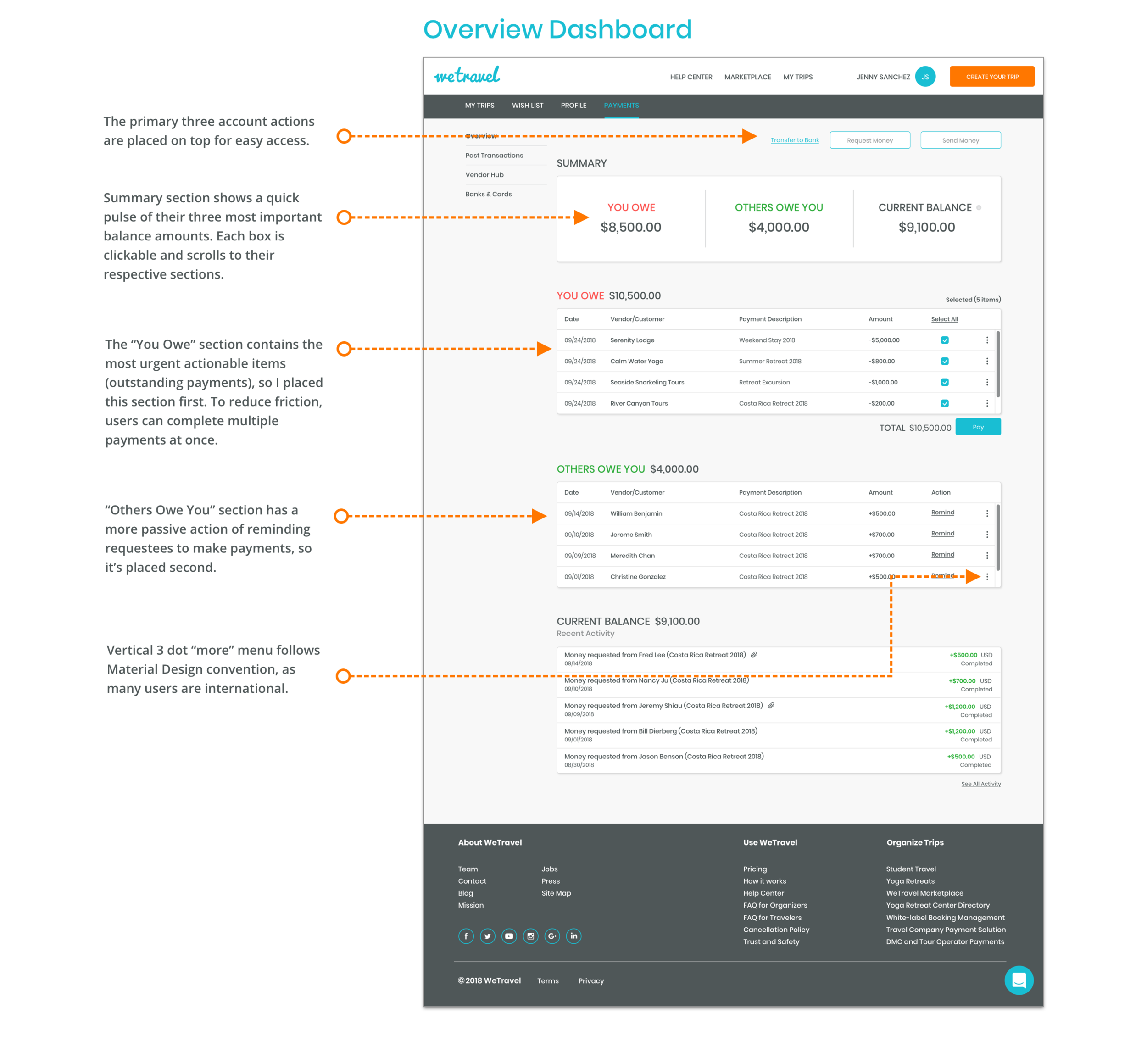
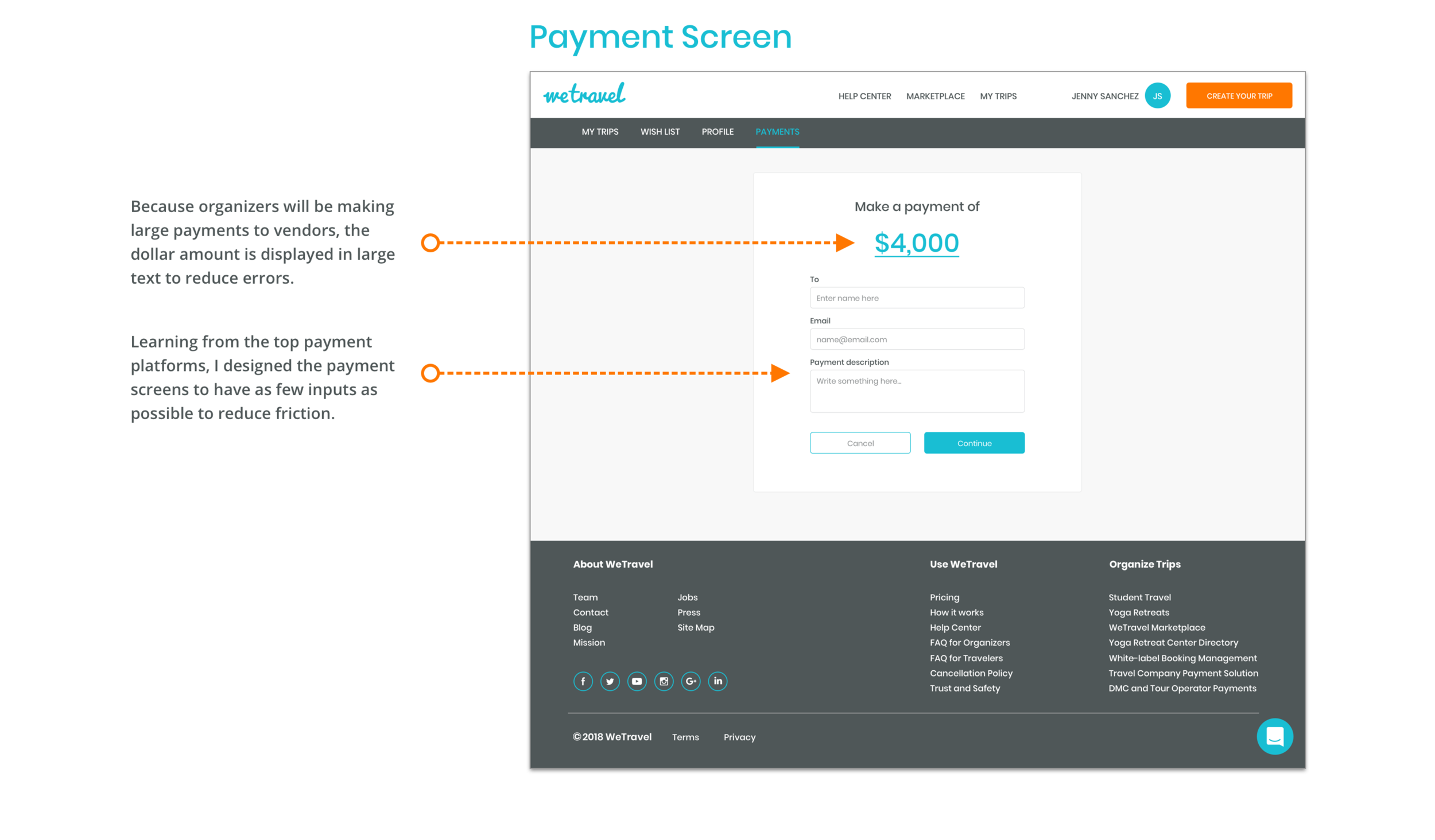
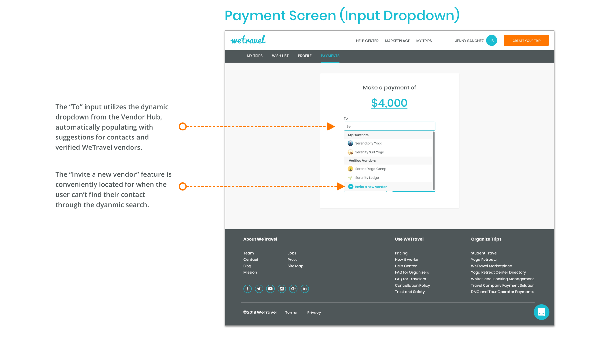
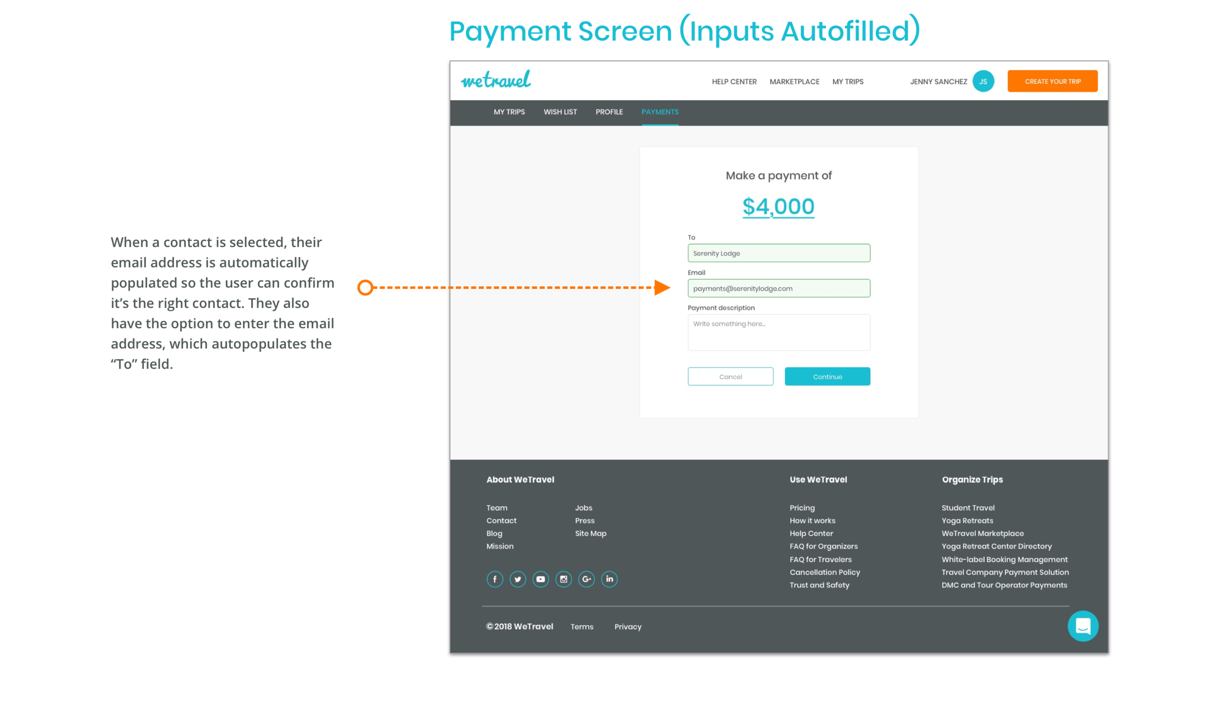
Through my research, I decided that the key features of the product should allow users to 1) store and manage their business contacts 2) see their transaction history and 3) handle outgoing and incoming payments. To achieve this, I split the payment platform into three key pages:

BUILDING TRUST WITH VENDORS
Based on my research, I understood vendors needed the familiarity of their existing customers in order to trust receiving payments through a new platform. To address this, a user's first contact with WeTravel needed to feel like it came from one of their customers. By designing the email invitation to look like a invoice sent from one of their customers for an outstanding purchase, I could build a feeling of trust and familiarity through the vendor's existing relationship with their customers.

CREATING VALUE FOR DUAL USE CASES
While the founders' vision for the vendor hub was to create more value for trip organizers, their current users, I wanted the product to create value for the travel vendors as well, as it would be essential to building out the community. This was especially important, as we found that users could potentially be acting as both vendor and a trip organizer, therefore needing both use cases of the site.
However, because the site would have a single view for both vendors and trip organizers, it was a challenge to build a product that would create value for both use case types simultaneously. This meant designing product features and crafting language that would be able to achieve dual purpose goals, especially on the dashboard and vendor hub contacts pages. Allowing vendors to request money was a very easy to implement feature that instantly created value and engagement opportunities, while also opening doors for them to invite trip organizers to WeTravel.
Design
EVOLUTION OF CONCEPTS
At each phase of the design process, I experimented with and tested different concepts and ideas. After settling on a sketch concept, a conversation with the stakeholders pushed me to include more features in the low fidelity wireframes. However, through testing the low fidelity prototype with users, I found that users experienced confusion on pages like the dashboard, where I tried to fit in too many features and action items. Using these insights, I reverted back to concepts from my original sketches for the high fidelity designs to simplify and declutter the interface.
INTEGRATION INTO THE EXISTING SITE
To create a product that would blend into WeTravel's existing interface, I followed their existing design system very closely, utilizing their same grid, design components, and brand elements. However, it was a challenge bridging certain interactions that would involve existing functionalities in the site. For example, to integrate the payment platform into the site, we had to completely redesign their existing "Banks & Cards" page in order for the interactions to bridge over to the new product.
Results
VALIDATION TESTING
After building a fully functioning high fidelity prototype, I tested it with users to validate the design decisions. Through testing, I found the following insights:

NEXT STEPS
For future iterations of the vendor payment platform, I would recommend exploring the following based on our research and testing:
Allow trip organizers to store and save documents related to payments and trips
Adding a purchase order and invoice generator to the payment platform
Allow trip organizers to create itineraries and easily share them with customers
FINAL THOUGHTS
Through building this product, I learned the importance of maintaining open communication with stakeholders through every phase of the design process. From the beginning of the process, I noticed that the founders often gave me little warning when technical constraints or project scope had changed, and I decided early on that I would need to proactively open up communication with them in order to keep the project on track. Once I initiated more frequent contact and discussion, the design work became much more of a collaborative process, with roadblocks being cleared earlier on.